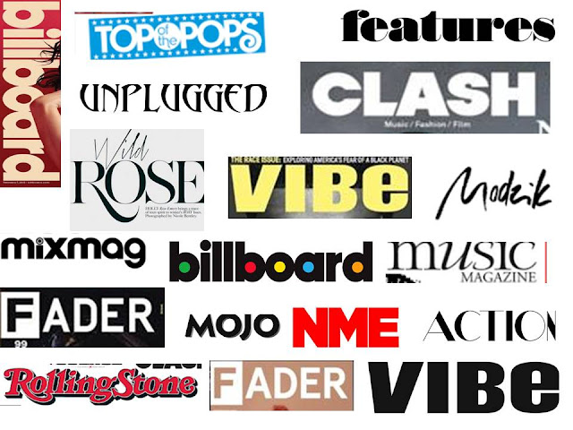
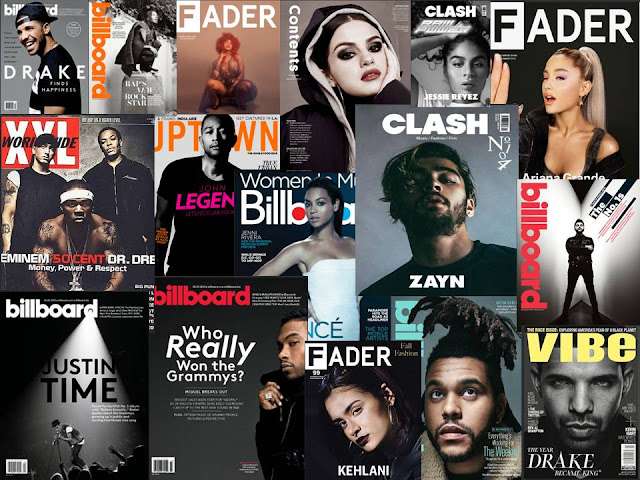
Most magazine covers follow one pattern the fact that there mastheads all have a bold font. This is because all of them wanna attract the eye of the reader and tell the reader automatically what they are about. For example the masthead "unplugged" this instantly tells the reader that the magazine is music relater more towards the pop rock aspect of music. It makes the reader know that the magazine is more towards the acoustic side.
The "CLASH" masthead again is more towards the RnB and pop aspect of the music industry. This instantly catches the eye of the reader as it is displayed in a bold font and placed in the centre middle of the magazine.
The "CLASH" masthead again is more towards the RnB and pop aspect of the music industry. This instantly catches the eye of the reader as it is displayed in a bold font and placed in the centre middle of the magazine.


Comments
Post a Comment